Translate this blog....

Showing posts with label photo review. Show all posts

Thursday, August 16, 2018

**REVIEW** KRSI Short Afro Kinky Curly Hair Wig

So.

I have decided to grow my own hair back out after cutting it a while back. There are medicines I take that make it hard for my hair to grow. I have to work hard at getting my hair to grow out evenly and healthily. Oh, how I miss the days when all I had to do was put in some braids for a couple of months... I don't really know anyone here to braid my hair so I decided to try wearing wigs for a while.

I've ordered 3 of the cheaper types and the first one arrived. It's the Short Afro Kinky Curly Hair Wig from the Amazon seller KRSI .  This is what the product page makes the wig look like:


Not bad, right? That's what I thought. Also, all the ladies who posted pictures showing themselves wearing this wig looked pretty amazing.

Yeah.  Well.

At first, I was NOT happy because this is what the wig looked like straight out of the packaging. (And I just realized that I didn't get a photo of the top side. Oops.)


I have to say that the color is more dark brown/red than the described "black" on the product page. Also, the part is SUPER obvious. Not good.  Still, I decided to just put it on and see what it looked like.

Uh... who let the Lion King loose?????
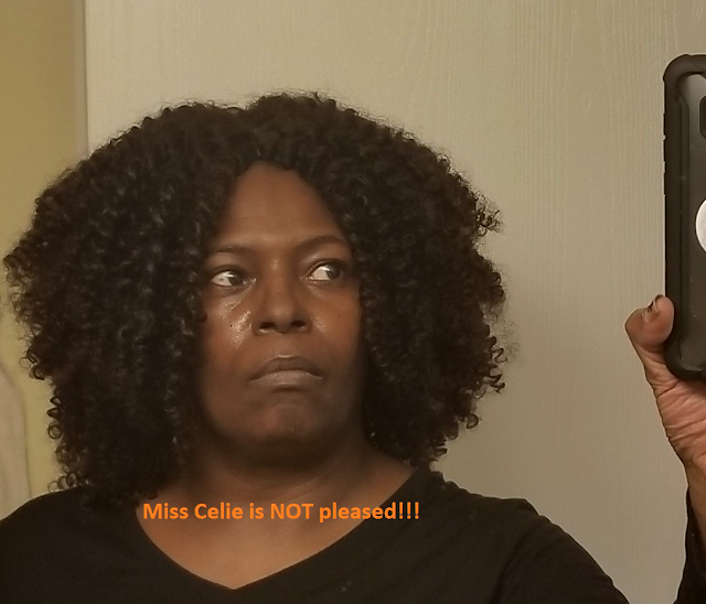
Hahaha!!! Wow...

Oh boy. When I finished laughing at myself, the first thing I thought was that there went $17 down the toilet. I can buy a lot of butter and eggs for that kind of money.

Okay. So maybe I could fix this mess, right? I went online and checked different resources. How to soften the curls in a poofy wig; how to make a wig look more natural; and how to fix an obvious part.

After finding some good suggestions, I used boiling water to soften the curls. Next, I started trimming down the ends so that I had a more manageable length. Last, I used my little eyebrow trimmer to give the part a more ragged look. The results are, I think, much better.


The most helpful suggestion I got came from, I think, Reddit and that was to not be so self-conscious. And that is a true thing. Even if people know that this is a wig, I can just think of it the same way I do makeup: as an enhancer. I have to stop taking myself so seriously, I guess - and stop caring so much what other people think and concentrate more on how I feel. This wig makes me feel pretty.

I'm the only black person in my apartment building. I can't wait until one of my neighbors sees me taking out the trash or something.

Anyway, just to sum up. I will tell you what I like and don't like about the wig. I gave it 4 stars. For the price and quality, I would have given it 5 stars if there had been more instructions for newbie wig folk. I had to work a little too hard on it.

What I like:
  • Looks pretty good for a cheap price
  • Came with a cap, inserted combs, and a set of lashes
  • Was durable under the boiling water (because it's heat resistant)
  • Doesn't shed as much as I expected for the price
What could be better:
  • That part. It's for Caucasian skin even though the wig if made for black people to wear.
  • The seams at the edges are very thick and have to be hidden with your own hair.
  • Took a lot of work to fit it to my liking because it was very long and VERY voluminous.
I will be doing reviews on the other two wigs when they arrive. They are from an Instagram ad that I'm kind of made about now. It will be a while I guess because they are shipping from freaking China...

Peace
--Free


Friday, March 16, 2018

**REVIEW** Fat Secret Weight Loss App

Well. For me, MyFitnessPal is over, done, and out. Finito. I deleted it from my phone and if I could block it, I would. I have found a replacement app that I love.

Welcome to my life, Fat Secret!!! ❤❤❤

Let me post some screenshots so you can get an idea of how useful the app is, then I will go into Pros and Cons. Let's start with the phone app, which is how I use Fat Secret the most.
*********


That up above is what the page looks like when you are inputting your food diary in the phone app. This is the page I use the most.

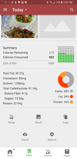
The photo below is the bottom of the food diary page. This is where you can see a summary so you can check your progress of how many calories you have left before you hit your threshold for the day.


The bottom photo shows a cumulative "report" of how many times you've eaten something. 


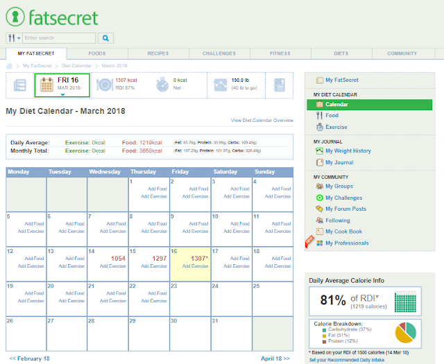
The photo below is another view of progress. It breaks down the days by caloric intake. It's a nice glimpse to let you know how your days are breaking down. My daily calorie limit that I set for myself is 150 so I can tell that the closest I came to that was on the 15th.  I wasn't finished logging meals today which is why the 16th looks so low.


I like the idea of having photo and scanner capabilities within the phone app. Users can (and I did) take photos of their meals for the day they were consumed. Also, you can look up nutrition info for foods in your kitchen by barcode. Most of the items I scanned came up as is. In cases where my item wasn't found, I was able to search a list of similar items. Once, I couldn't find my exact brand of chicken breasts. It was store brand. I quickly found a brand that had the same info as that on the label of my chicken. Cool.

By the way, you get the option of sharing or not sharing your stuff with other members. If you want to share your food photos but you don't want to share your weight tracking, fine. If you want to share with the Public community of Fat Secret, you can - or you can choose to only share with your Fat Secret "friends". That brings up another point: you can choose to follow other community members. You can also join groups and give kudos to other people's entries or shared info. I'll get to that in a moment when I move on to the web app/site.


This photo below is a beautiful thing. When I first saw it, I assumed it had something to do with a paid version of the app. No, no. The app is totally (as of this post) free. The My Professionals section is for inviting, say, your doctor to peek in and see how you're doing. I'm not sure how it works, but I will test it when I see my doctor next - if she wants to sign up and do this. Very handy.


The Recipes section is pretty cool. I have submitted 2 of my recipes and am waiting for Admin approval before they are posted. So you see that you can brown recipes and get some ideas for your meals. 


What's especially cool about the recipes is that you get so much information when you look them up. For example:


When I submitted my recipe, I had to input the ingredients, prep & cook times, and list the steps to take to cook the item. The app fills in the nutrition information based on the ingredients listed. I love that.
Let's say, you kind of like that recipe for Chicken Tostadas but you maybe want to keep browsing. Well, look how helpful it is to see even more recipes using chicken breasts.


Remember what I said about sharing or not sharing? In the phone app, you can find the options on the Settings screen - and you can get to the Settings the usual way.


There are also options for setting reminders, allowing comments, etc.


 You can even choose a color scheme for the phone app.


Now, moving on the website app,  you will see why I prefer using the phone app.


This is the page I land on for "Home" and I don't like that. What I want is to get to MY stuff. This page starts you with what seems to be everyone's activities. 

When using the website, I have learned to go straight to the right-hand sidebar with the green highlighted My FatSecret. The sections there will get me to my stuff. Not to be selfish, but I'm happy to see what everyone is doing but this weight loss is my weight loss.


You can see your "calendar" by a list view or month view. This is the "list" view:


And this is the "month" view.


I talked about being able to add recipes. Apparently, it takes a while to get them approved by Admin and, I guess until they are approved, you can't add your submitted recipes to your cookbook.


So, this Fat Secret is kinda nice, yes? Very much so. Now, Pros and Cons.

PROS

  • The phone app is wonderful and much easier to use than the web app.
  • The site is fun and interactive if you like being in a community for the support.
  • The database of ingredients is pretty right on so far
  • It's motivating to have a weight tracker within the app
  • The scanner for looking up ingredients and nutrition info is very helpful and easy to use
  • The phone app info syncs well with the website if you need to switch back and forth
  • The support team is very responsive to questions when you contact them

CONS
  • The web app (site) is not nearly as good as the phone app
  • The phone and web apps both take some getting used to. The features in the web app are not always easy to find.
  • It's not easy IMO to copy and paste individual foods from one days meal to another.
  • I have yet to figure out how to save my favorite foods that I will be adding on a regular basis
Listen, overall, the phone app is dang near perfect and since it happens to be what I use the most, I'm happy. Some of the issues I have with the website may be due to being a newbie. I'm sure I'll get the hang of it soon.

Every little bit of motivation helps when you are making lifestyle changes. Fat Secret is going in the right direction to being perfect.

By the way, as of today, I am down 10 pounds since March 5th when I started Intermittent Fasting. I'm taking selfies to share in a slideshow or something once I have reached my goal weight.

Peace
--Free